

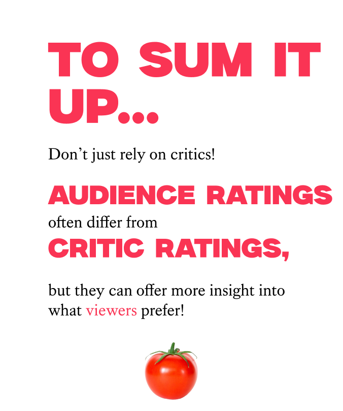
In my final semester of college, I took a Data Visualization class, and found a whole new world of design to explore. I learned how to clean up data in Google Sheets and Excel, create visualizations in Tableau, and found a new level of creativity in visualizing data. My final piece for the class was a project on blockbuster movie data spanning over 50 years, with over 400 movies in the data set. I sorted the data—which was very difficult, might I add— and found a story that I knew I wanted to tell: audience versus critic reviews. While cleaning up my data, I realized that none of the scores ever matched up, no matter how I filtered them. Movies by decade, genre, profits— nothing ever matched up. I thought this was incredibly interesting, because we put so much tock into critic reviews. Well if they aren't the same, then who should we listen to?


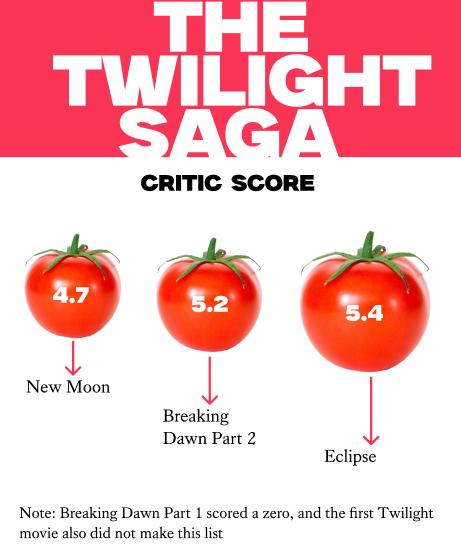
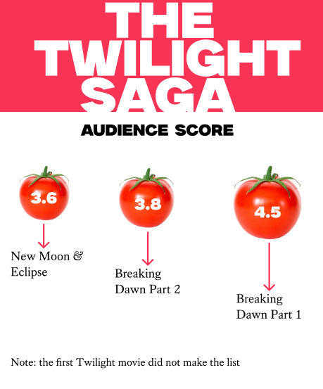
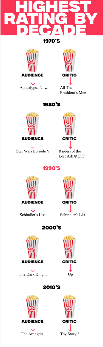
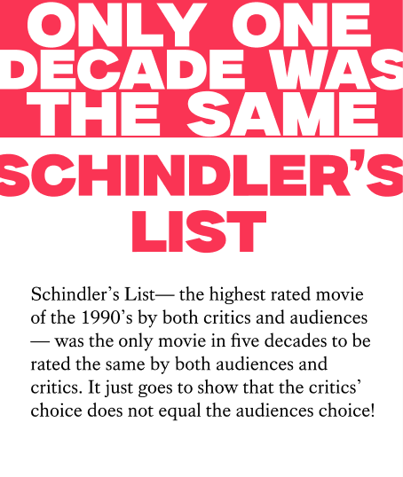
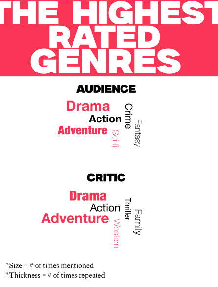
Since the format of the project could be anything I wanted, I decided to try something out of my comfort zone: an Apple Watch. I made my project on Figma, and I've predominantly used iPhone and MacBook wireframes. I wanted to do something different, so when I found wireframes for Apple Watches, I had to choose them. Using this device in particular was a huge challenge for two reasons; one, it's about a quarter of the size of an iPhone, and two, I don't own an Apple Watch. I don't know the interface at all, so a lot of my research was on Apple Watch UI/UX. Because they are such small screens, I really had to narrow down my data story to the most important, interesting pieces. I chose three things to focus on: a series, the highest rated movies (audience vs. critic) by decade, and the highest rated genres. I picked the Twilight series because of its cultural significance, and was shocked to see how different the ratings were. Schindler's list was the only movie that had the same rating by both audiences and critics over a 50 year period, and the genres largely differed, as well.