Why TV Matters is my senior thesis project on the importance of representation on TV. It is an interactive website prototype, and it's the culmination of over a year of research and designing. Why TV Matter started as a short final project from my Women and Popular Culture class, and grew into a website that faculty and peers contributed to. After researching, interviewing, writing, and designing for the past year, this is Why TV Matters.
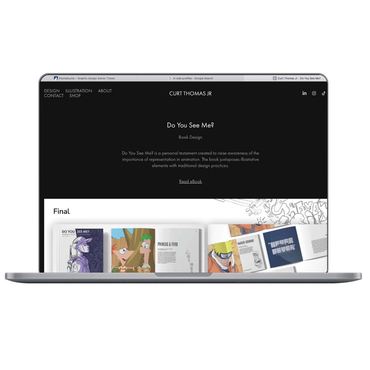
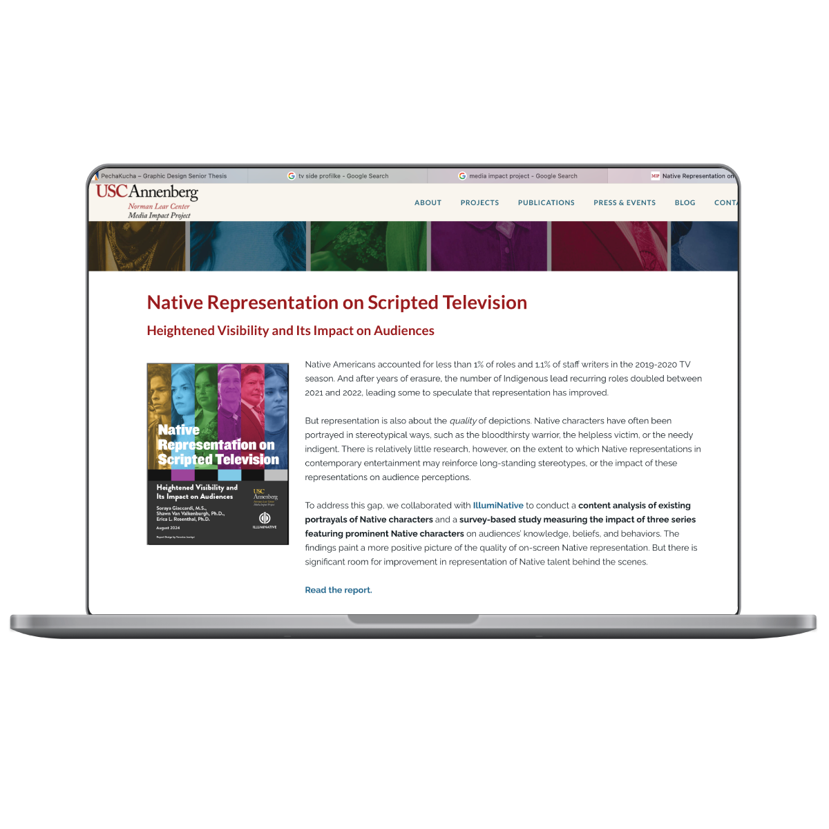
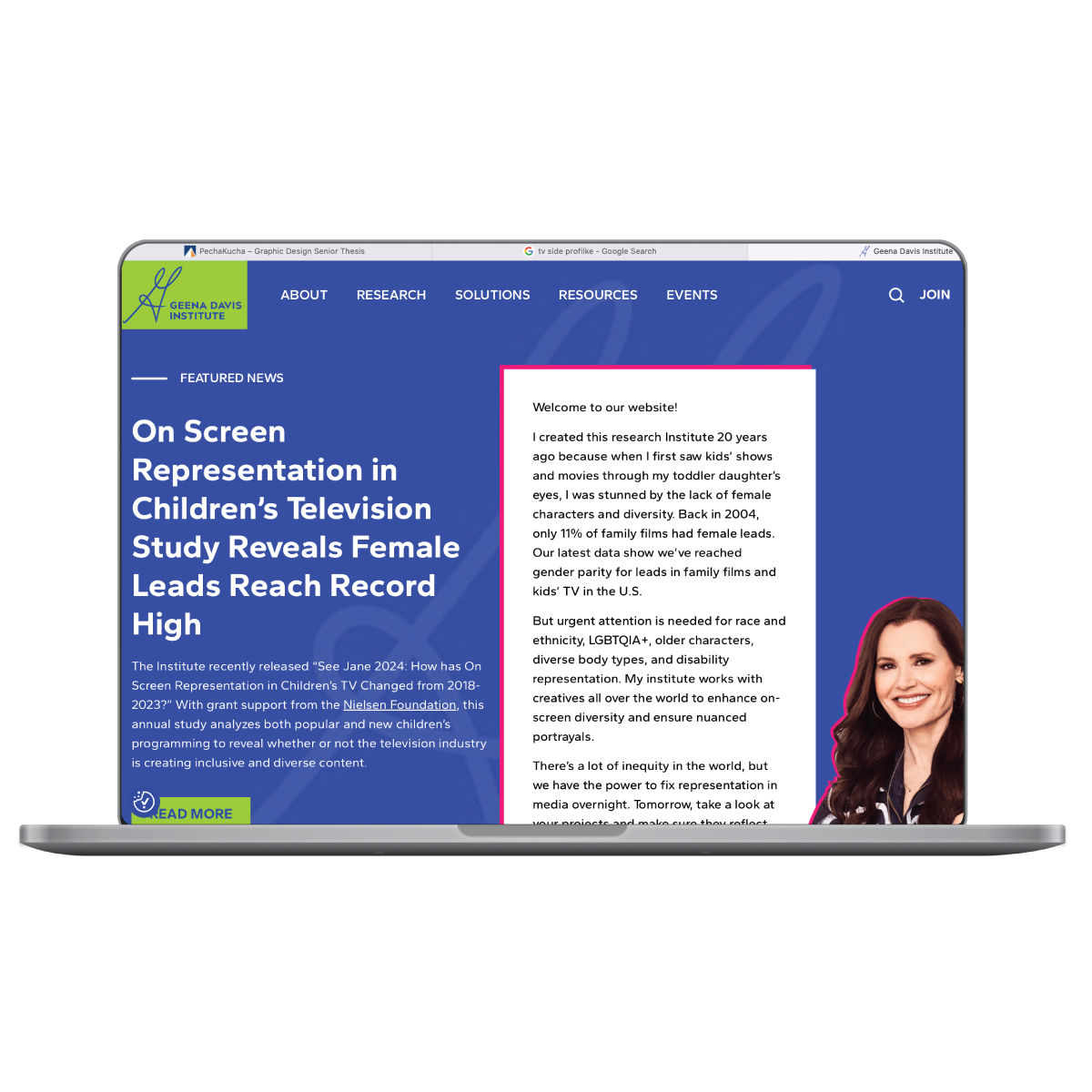
My original final project back in spring 2024 was a simple Pecha Kucha— a five minute presentation consisting of only pictures. The prompt was to explain why anything we wanted to choose matters. My first idea was was to do my project on the show Reservation Dogs, but after speaking to my professor, I realized that there was more to talk about when it comes to TV than I could ever fit in one final. My research for this project included books, articles, scholarly journals, and three existing projects: The Gene Davis Institute, Media Impact Project, and Curt Thomas' "Do You See Me?"
My project went through approximately four changes over the course of my research. My initial scope was to tackle children's shows and target my project towards parents. However, I haven't watched shows for people that young in many years, and I couldn't relate to those shows anymore. I still wanted to include some of the TV shows that my mother used to point out to me as a child, but I realized that using specifically children's shows was extremely limiting. Although it took me a while to figure out how I wanted share my topic, I decided to research the complexities and nuances of representation on TV. I wrote my thesis proposal, and got ready to start designing and iterating.
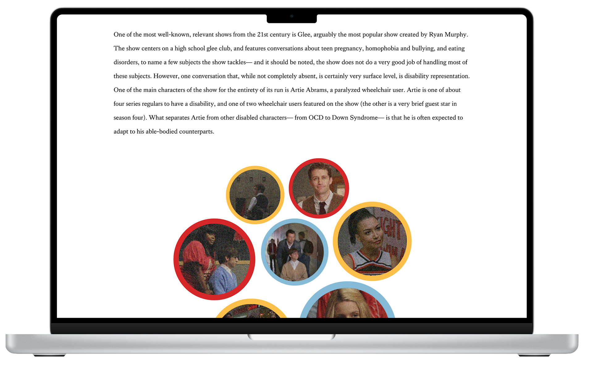
I settled on three areas of representation, and three varying web pages: gender (the round table interview with peers), race (an interview with my Women and Popular Culture professor), and disability (a case study that I wrote and checked with our Disability Resource Center). I was ambitious when I made my initial wireframes. When thinking about my user-interface and experience for viewers, I didn't necessarily think about what would be feasible for me to make. One of the biggest lessons I learned while building my website was that I am part of the user experience. I wanted to make something complex and new, without factoring in what I could reasonably do in the time that I had.
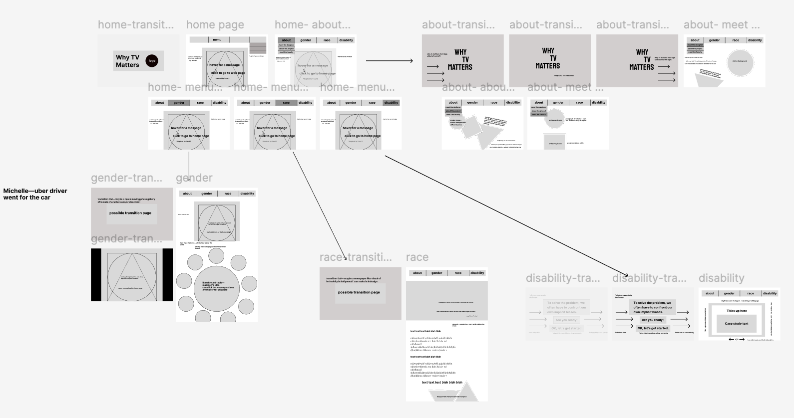
My thesis professor advised me to stick with the TV glitch theme I had used in my thesis Pecha Kucha, but I decided to change the color palette. My biggest design principle is to always design with accessibility in mind, so I searched for colors with high contrast that wouldn't "vibrate" against each other. I started mixing palettes together, and came up with the primary colors as my main three, and three lighter shades as my accent colors. I also went through many, many fonts, and at the midterm review, I received some feedback to change the font I thought was the winner. I'm so glad for that feedback, because the font I initially wanted to choose did not fit my topic as well as Lineal, the font I ended up going with. I made at least four different version of each web page, and workshopped a lot of them with my classmates during our midterm review. The feedback and help they gave me became of my final web pages.
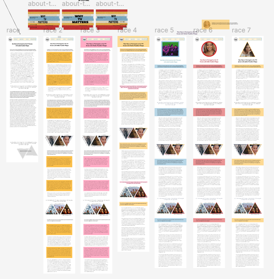
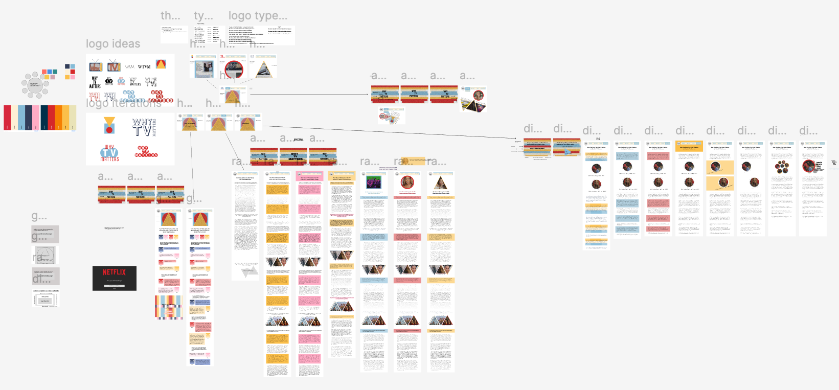
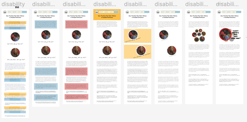
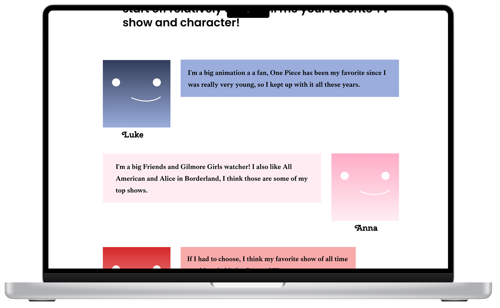
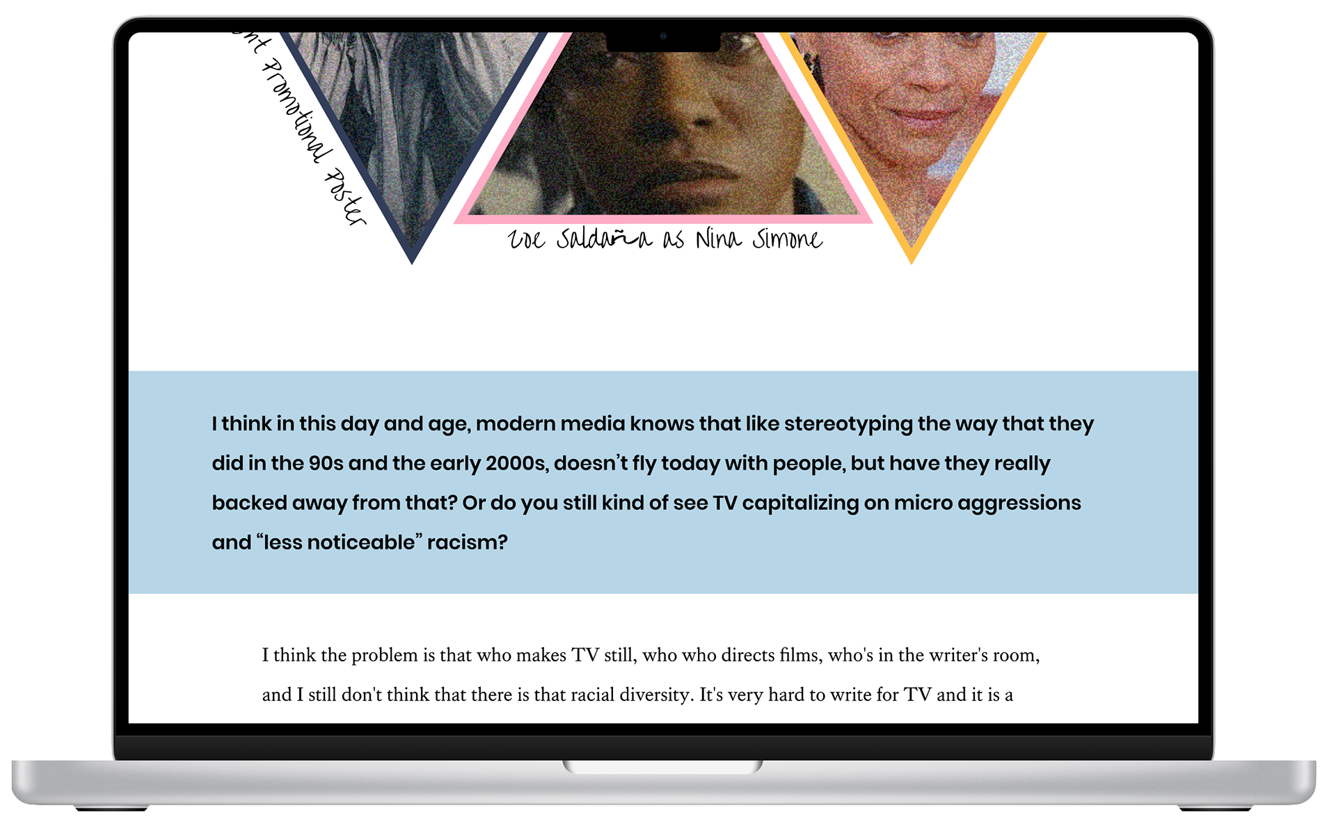
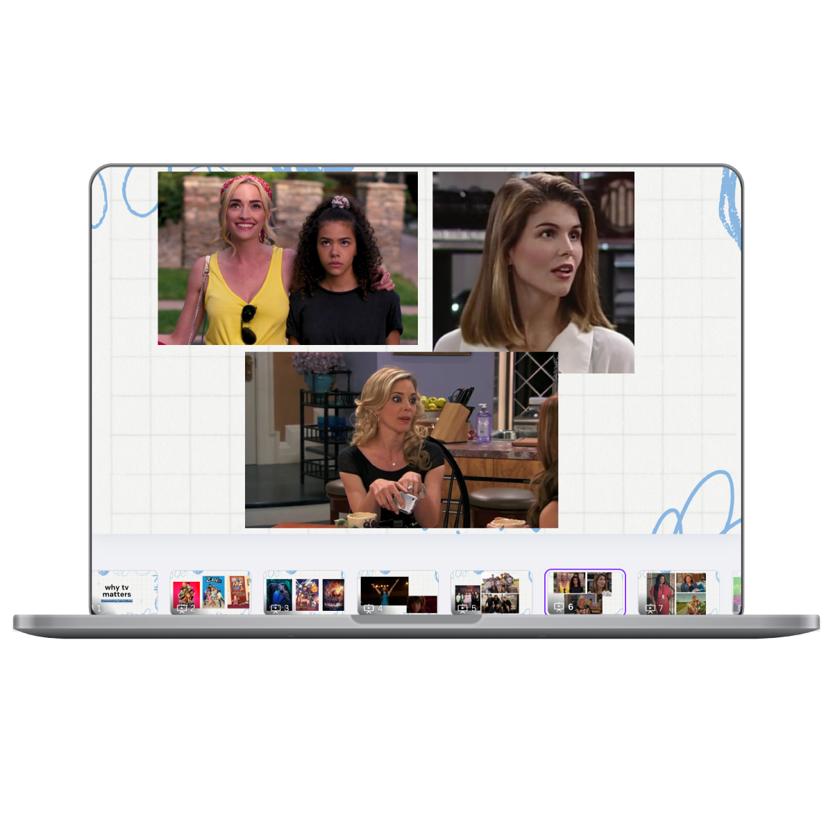
My final wireframes—drastically simplified from how they started— still utilized color blocking, but in a way that made it easier to comprehend while scrolling quickly down a page. Transition pages and interactions are meant to break up the white background and add more color blocking, while pop culture references (i.e., the Netflix profiles) and imagery provide context, color, and break up the pages. Shapes were one of the most important visual language aspects, particularly in keeping the website from looking too boxy and rigid.